Build Early Money Habits
Designed the interface for desktop and mobile to create a distinct visual identity for the client

Navigating the Finance World
All a parent could ever want for their children is to live a good life, be happy, and know that they are financially secure. The value of learning about personal finances early can set up your children for a successful future. According to Forbes, 50% of children surveyed wish their parents taught them more about money. With so much information about finances on the internet, it can be difficult to find what website is best and will benefit your children. Here is where Build Early Money Habits can make a difference for your children’s future.
Brief: Designing a memorable interface for desktop and mobile to create a distinct visual identity for the client.
Challenge: Lacked a brand identity and digital experience for parents to learn about the program and sign up their children for a course and receive educational resources.
Goal: The goal is to conduct visual research and analysis and use insights to develop brand attributes and artifacts to give the parents a distinct visual identity with impactful user-centered designs
Timeline: 2 weeks, December 2023
Tools: Figma, Zoom
Creating a User Persona

To better understand our user’s needs, goals, and pain points, a user persona was created based on the design brief. The user persona is as follows:
Tony, who lives in Houston, is a store manager at a local hardware store and is a father of three children, 8(F), 10(M), and 11(M). He always struggled with finances and recently his eldest child spoke to him about an allowance. They are a middle class family and figured this would be the perfect time to educate them on personal finances. Only issue was that he didn’t know where to start. He works on the weekends and isn’t able to drive them to an in-person program held at their library.
SWOT Analysis
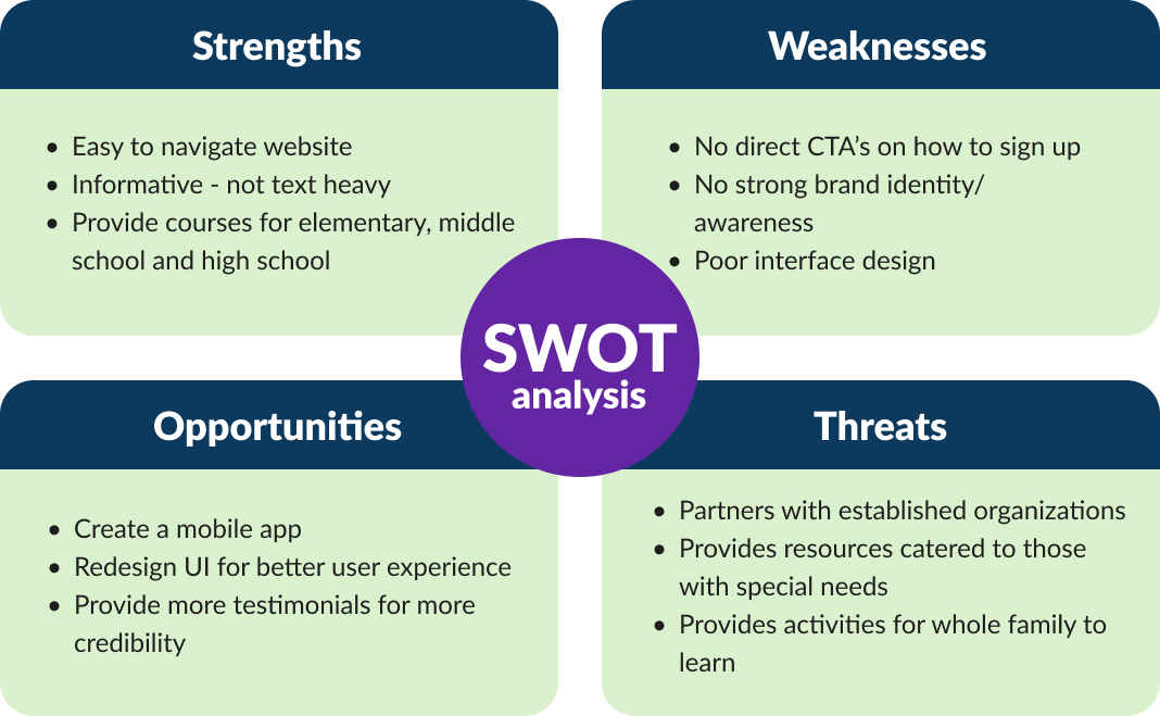
When doing competitive research it was seen that most of the competitors’ had an easy to navigate website and was very user friendly, especially everfi.com and youth.handsonbanking.org, but the websites provided no strong brand identity. A few of the competitors offered courses for grades K-12 but were programs that were meant to be incorporated into a classroom setting, such as moneytimekids.com and fitmoney.org. On jumpstartclearinghouse.org, they provided resources to help teach kids with special needs which was something I saw no other competitor providing.
All competitors lacked an app. The websites focused on educating parents and teachers about courses for class integration with the exception of everfi.com.
The next step before sketching out the wireframes was to do use the MoSCoW method to help prioritize what features to include and emphasize

User Flow Chart
The next step before designing the interface was to establish a user flow chart. This diagram is used to visualize how users will navigate the website/mobile interface to accomplish their goals of learning about the online course and signing up their child(s) for the program.

Low-Fidelity Frames
I started the design process by sketching low-fidelity wireframes, aiming to visualize the functions based on the user persona created and user flow chart. These were the rough sketches for pages I wanted to include on the website - homepage, our mission, a page for parents to learn more, the signing up process, the student portal login, and also the dashboard for the students

Homepage #1

Our Mission Page

Contact Us Page

Student Dashboard #2
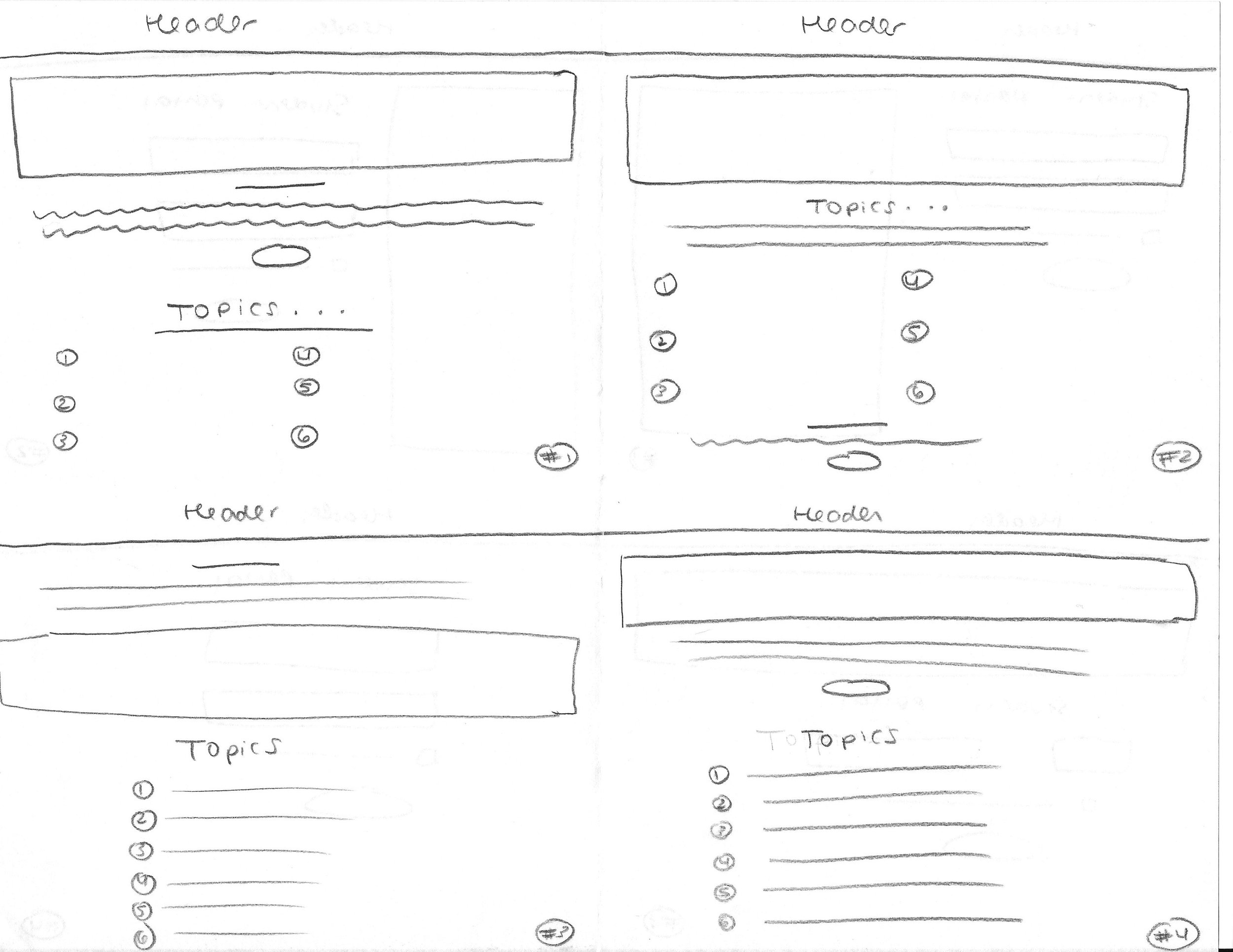
For Parents Page

Student Portal Login
Homepage #2
Signing Up Page
Student Dashboard #1
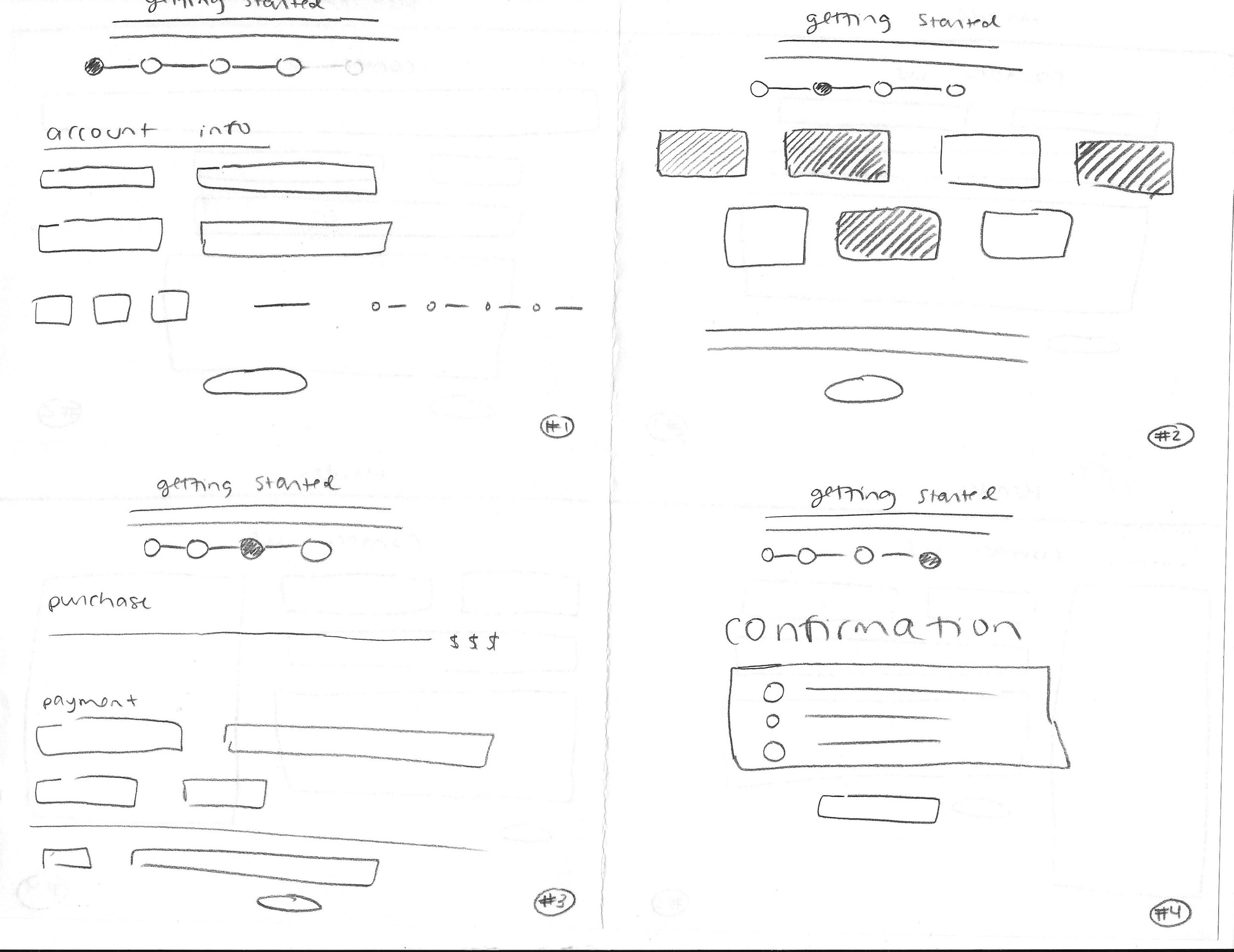
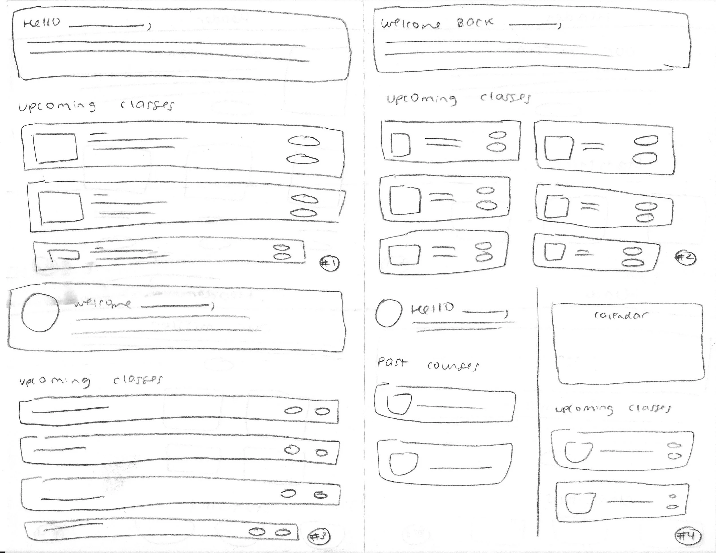
Mid-Fidelity Frames
After the sketches, I created mid-fidelity wireframes to establish additional content and UI elements, maintaining a strong focus on visual hierarchy and grid-based design.
User flow: Read through the home page and then find your way to the ‘Our Mission’ page. From here, proceed to go sign up for the online course..

Usability Testing
I tested five users' ability to complete the task in the prototype. In a mix of in-person and Zoom 1:1, I tested the prototype with parents of children between the ages of 8-12. I measured success by the number of user errors and the reported ease of navigation through the tasks. I also wanted to see how well the app addressed users' pain points, motivations, and goals.
5 Participants
100% Success Rate
Useful constructive criticism
“The home page definitely grabbed my attention but include more info during the signing up process”
Overall, participants navigated through the user task with ease – there was no confusion or any hesitation across all five tests. The layout of the website was very user-friendly and finding their way around required not much effort. However, they all had comments about the content being provided. Almost all users had the suggestion to add something to showcase how far along they were in the sign up process and to possibly write a sentence or two with each step. The area felt empty and thought it would provide clear instructions/directions.
This was a quick and easy addition that I could easily incorporate into the high-fidelity frames.
Style Tile
By applying visual design principles, I created a style guide to summarize Build Early Money Habit’s important design elements.


Build Early Money Habits
With taking all of the users feedback and incorporating the brands colors into the design, I was able to create the final prototype
Provided a meter for the Sign Up process so users can know how far along they are and also provided instructions/directions for each step
I implemented the brands images to create an emotional connection with users, enhance brand identity and to overall make the website more visually appealing


Reflection
For this case study, I really loved having complete creative freedom for the UI design of the website and mobile design. I enjoyed picking out every small thing from the color palette, to the font, to even the images I wanted to be used throughout the site. I achieved my goal of wanting it to be a sleek and user-friendly interface so parents/guardians can navigate through the site easily.
For the future, I would love to play around more with layouts and the hierarchy of a website. I want to be able to have more fun and memorable interactions throughout a website and mobile design.
Something I would have changed throughout this process after some reflection, would be to adopt the mobile-first design approach. More and more people are accessing websites through mobile devices making it important to prioritize the mobile experience. Since there is limited space, it forces us designers to prioritize essential content and create a more focused layout.